
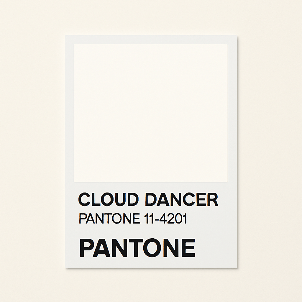
Every December the world waits for Pantone to unveil its Colour of the Year. Designers hold their breath. Brands scramble to interpret it. The public reacts in a mix of awe, confusion or outrage. This year has been no different, except the uproar has been louder. Pantone chose Cloud Dancer, a soft white that many insisted was not a colour at all. Social feeds exploded with claims that Pantone had lost its touch or had sold out. How could the global leader in colour choose something so quiet at a time when the world feels loud.
Yet the truth is far more interesting. Pantone did not retreat. Pantone advanced. In fact, Cloud Dancer may be one of the most strategic moves the company has made in years.
Pantone is not a trend page on Instagram. Pantone is a business. One built on the science, psychology, and consistency of colour. Its authority comes from solving a universal problem. Before Pantone, colour was a guess. A designer would choose a shade of red only to discover that the printer, the manufacturer and the retailer delivered three different versions of it. Pantone created a language everyone could understand. In doing so, they created an empire.
Their success is not only in colour guides. Pantone makes money through licensing, collaborations, digital colour tools, consulting and the Pantone Color Institute. Colour of the Year is only one thread in a broader brand system. It generates global press. It shapes conversations. It reinforces Pantone at the centre of creative culture. Whatever the public thinks of the final shade, the world is talking about Pantone. That alone is influence.

Choosing Cloud Dancer is not a misstep. It is a masterclass in brand building. Because Pantone understands something many forget. Colour is not only pigment. Colour is meaning. Colour is mood. Colour is humanity held in visual form.
Consider the moment we are living in. The world is exhausted. People are overwhelmed. Societies are saturated with noise and conflict and bravado. Creative professionals know this fatigue intimately. When a new project begins, they do not start with a neon pink or a saturated teal. They begin with a blank page. A white canvas. A clear screen. A quiet moment before the imagination takes flight. That pause is not emptiness. It is potential. It is permission to begin again.
Cloud Dancer represents that moment. It is the colour before colour. The shape before the sketch. The breath before the story. It mirrors the sky on a day when the clouds drift slowly and invite you to see what you want in their movement. A horse. A wave. A dancer. That is imagination at work. That is possibility returning.

This choice also speaks to mental health. A reset is not frivolous. It is necessary. People are looking for ways to declutter their minds and rebuild their emotional rooms with intention. A soft white that whispers rather than shouts answers that need. It reminds us that clarity is a creative act.
Critics argue that Colour of the Year should be bold. Something you can point to. Something worthy of global attention. But why must every message arrive in high saturation. White space has been one of the most fundamental design principles for generations. Designers preach about the importance of room to breathe. The eye needs rest. The mind needs balance. Brands need clarity. Cloud Dancer channels that truth in a way that feels both surprising and overdue.

And if the public is confused by the choice, then Pantone has succeeded again. Because the best brand moves are often the ones that interrupt expectation. Look at Michelin. Most people forget or never knew that Michelin is first and foremost a tyre company. Yet it built one of the most respected food rating systems in the world. A tyre brand that tells you where to find the best restaurants. The connection could not be more bizarre, yet it worked because the strategy was not about the category. It was about cultural influence. Michelin stars shaped global dining. They became the authority not because they were expected to, but because they dared to.
Pantone is doing something similar. They are stretching their authority without breaking it. Colour of the Year is no longer just a swatch. It is a story about what people feel, what they crave, and where the world is heading emotionally. Cloud Dancer allows Pantone to join conversations about mental wellbeing, creativity, imagination and renewal. Those conversations are evergreen. They reach beyond designers. They touch everyone.
From a business perspective, it is genius. Cloud Dancer feeds directly into Pantone’s ecosystem. It drives collaborations in interiors, beauty, lifestyle and fashion. It encourages designers to rethink minimalism not as a trend but as a reset. It positions Pantone at the centre of the global mood. It keeps the brand relevant, modern and human.
Pantone has always known that colour is a universal language. Cloud Dancer is their reminder that silence can speak too. It reflects what the world needs more than anything right now. Space to breathe. Space to begin again. Space to imagine.
Call it controversial. Call it brilliant. Call it unexpected. Cloud Dancer is not the absence of colour. It is the beginning of it. And perhaps that is the point.


